Agricultural drone versus tractor · External collaboration · Graphic design
When the data has to explain the difference at a glance.
A social-media graphics series comparing an agricultural drone with conventional machinery. It came from a colleague’s earlier external collaboration, not from a Rise.sk contract.
Information
- How this came about
- A member of our team worked on these under an earlier external collaboration. Rise.sk was not the main supplier.
- Project type
- Infographics for social media
- Our role
- Graphic treatment of supplied material and visual unification of the series.
- Project status
- A published series of graphics
Technology
- Canva
What you will learn
- 01How to split an image so the comparison lands before anyone reads a caption.
- 02How a single bar chart can carry the whole argument about water use.
- 03How to keep a series coherent across horizontal and vertical formats.
01
A technical subject in an ordinary feed
The brief arrived as figures on water use and crew, and on spraying efficiency. Nobody unpacks a table in a feed, though. The decision to keep scrolling takes about two seconds.
So the numbers became a picture. The comparison had to work for someone who knows nothing about farm machinery.
02
A split image as the organising idea
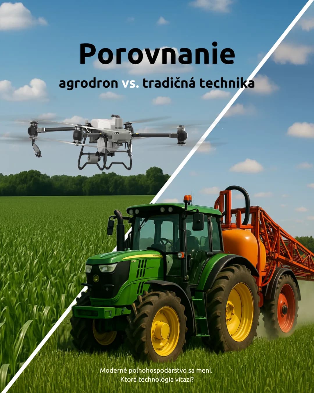
A diagonal cuts the composition in two. A drone over the crop on one side, a tractor with a sprayer on the other. The contrast registers before the headline does.
The same split holds the series together. Every further piece repeats it, so the posts read as one set rather than separate images.
03
A chart nobody has to read twice
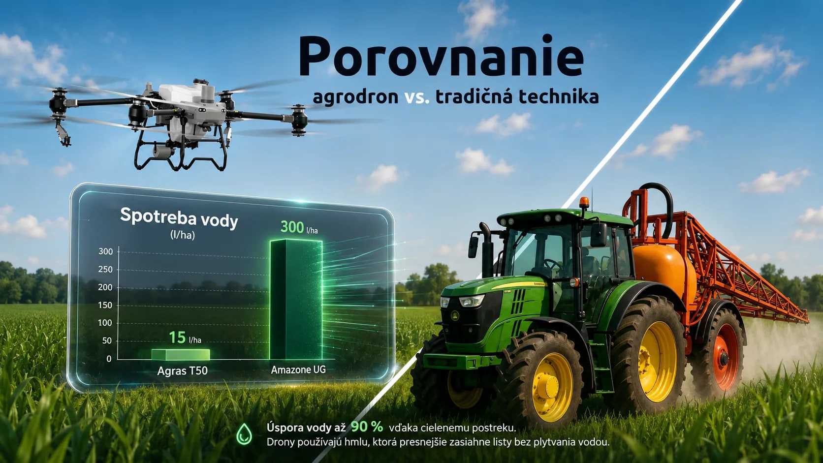
Water use is the strongest argument in the set, so it got its own bar chart. The client supplied fifteen litres per hectare against three hundred, and two numbers like that need no commentary.
The chart stays on one quantity and one unit. The line underneath explains where the difference comes from.
04
One series, two formats
The horizontal piece has room for the chart and both machines at once. The portrait one works as an opening slide that asks the question and invites the next swipe.
Both come from the same scene and the same typography. The layout shifts and the character holds.
05
Which part of this was ours
The client supplied the source material and the figures, and the technical claims. Our part was the graphic treatment and holding the series together visually.
It came out of an earlier external collaboration of our colleague. Rise.sk was not the main supplier, and we do not present it as our own delivery.