Product advertising concepts · Concept · Graphic design
The detail that gives a product room to stand out.
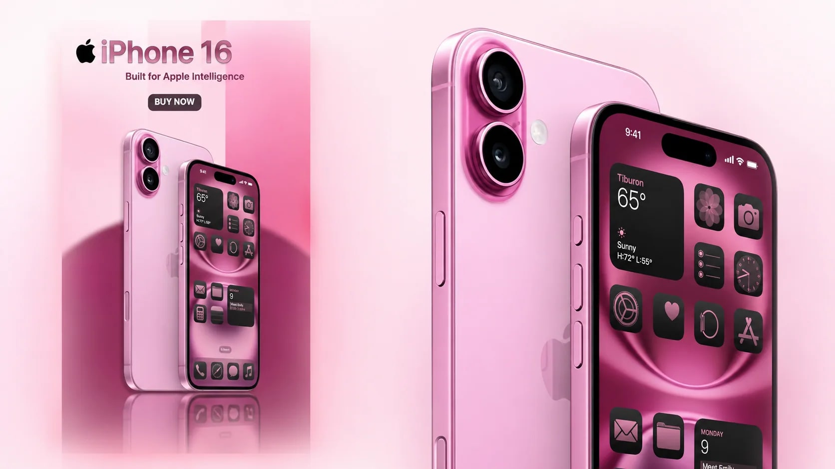
Two product visuals by Veronika K., made to show composition and colour, and typographic hierarchy. Unofficial concepts. Apple had no involvement in them.
Information
- Brand relationship
- An unofficial, self-initiated concept. Apple was not involved in the project.
- Deliverables
- A horizontal advertising banner and a vertical product visual
- Our role
- Visual concept and execution. Designed by Veronika K.
- Project status
- Unofficial portfolio concepts
Technology
- Adobe Photoshop
What you will learn
- 01How to send the eye to the product before the words.
- 02How one palette can carry both a quiet and an energetic register.
- 03How the same product is composed one way for a banner and another for a Story.
01
The product keeps the attention
Both pieces lead with the product and keep the type hierarchy clear. Very little else is added. The composition takes the eye to the product first and to the message second.
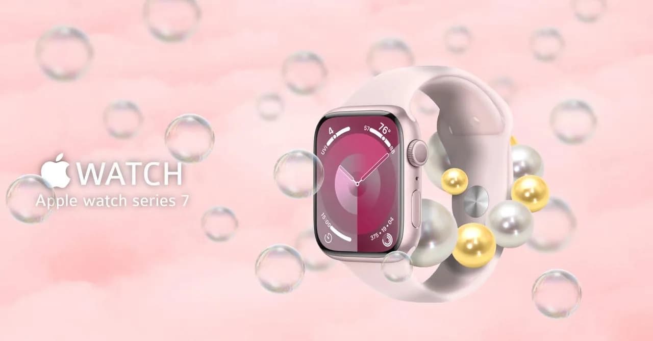
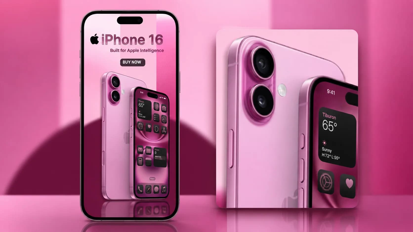
The watch got the softer, more decorative treatment. The phone runs on stronger contrast in a vertical format that suits social feeds and digital placements.
02
The small things decide it
In product graphics the small things decide the result. Spacing, light, shadow, the size of a heading, where the button sits. They are what makes a visual look considered and easy to read.
So the product edges are clean and the type is legible. The layout holds its balance. The detail is not decoration here. It is what makes the product look worth the money.
03
Colour sets the mood
A pink palette ties the two together, and each uses it differently. On the watch it stays soft and elegant. On the phone it turns up the energy.
The colour is not decoration. It unifies the composition and lifts the product, and it gives the piece a mood you can recognise.
04
One product, two formats
A horizontal banner has the room to balance product and text side by side. A vertical one walks the eye down from the name through the message to the product.
Where a graphic will run is part of the brief. A web banner needs a different layout from a post or a Story. A paid placement needs another.
05
What the pair adds up to
Two concepts, two ways to present a piece of hardware. What they share is the attention to detail and a clear visual hierarchy, and one colour treatment.
Both began as exercises. The brands appear only as a familiar shape to compose against, and nothing more.