
VIAC AKO NI(c)K · Public mobile application
When writing means taking the first step.
Together with HexaTech we reworked the VIAC AKO NI(c)K mobile app, from server calls to conversation screens. It gained a typing indicator, attachments and an emergency exit, and now holds steady.
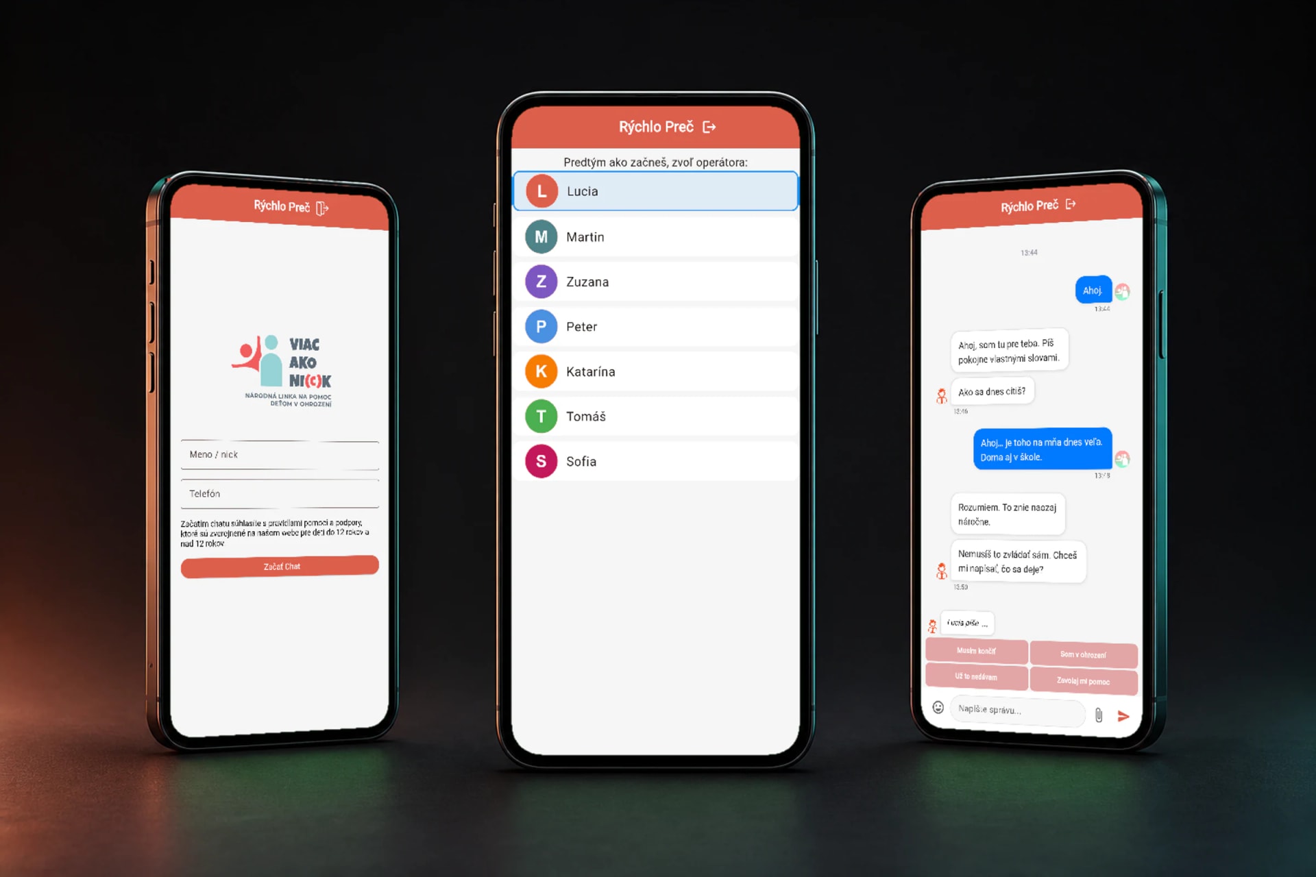
Journey to a conversation
One calm flow from a nickname to a safe exit.
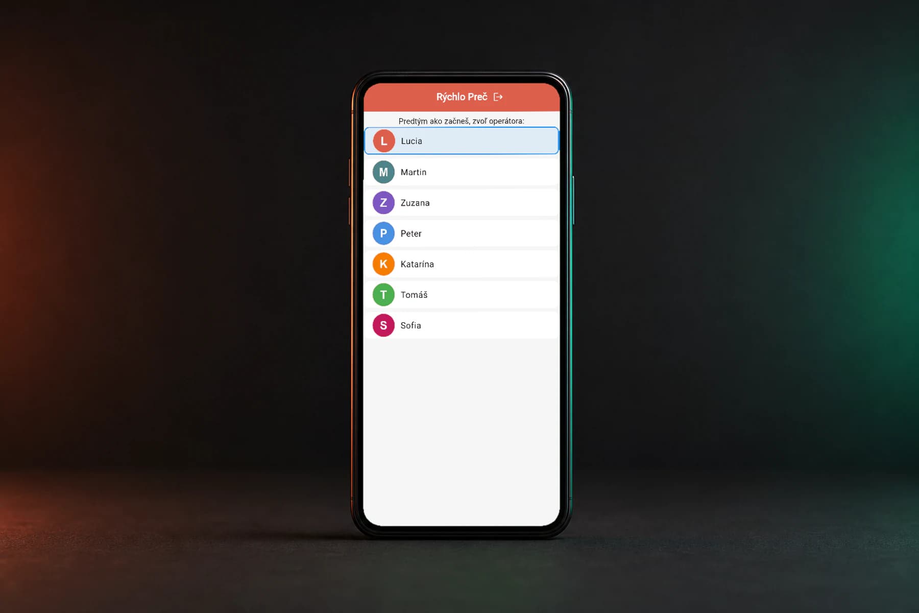
The redesign takes people from registration to a consultant and into the conversation, with no detours on the way. Quick replies and attachments stay in the chat context, and so does a safe exit.
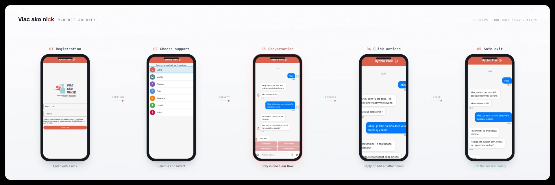
Scroll the diagram sideways.
- 01
Registration
A short entry with a nickname and a clear next step.
- 02
Consultant selection
Available support is clear before the chat opens.
- 03
Conversation
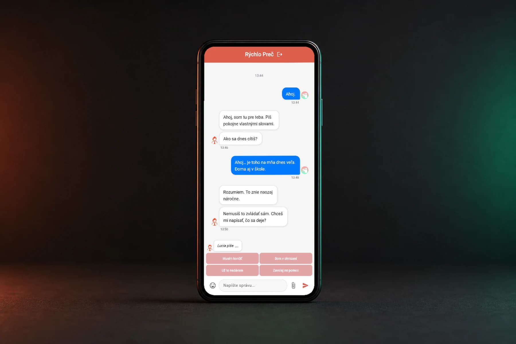
Messages and their time keep the conversation easy to follow, with the typing state alongside.
- 04
Quick actions
Replies and attachments stay close without leaving the conversation.
- 05
Safe exit
Ending the session is a visible part of the whole flow.
Information
- Project type
- Public mobile application
- Platform
- iOS and Android
- Our role
- The app was already running. Together with HexaTech we redrew selected parts of the interface and added new features, and we fixed bugs in the code.
- Partner
- HexaTech s.r.o.
Technology
- Flutter
- Dart
- iOS
- Android
What you will learn
- 01How to redesign an interface so it stays out of the way in a sensitive context.
- 02How to improve the stability of one Flutter app across two platforms.
- 03How Rise and a partner team share delivery responsibility.
01
The first step
VIAC AKO NI(c)K offers a mobile way to start a conversation with a consultant. When someone opens the app in a difficult moment, the next step must be clear.
02
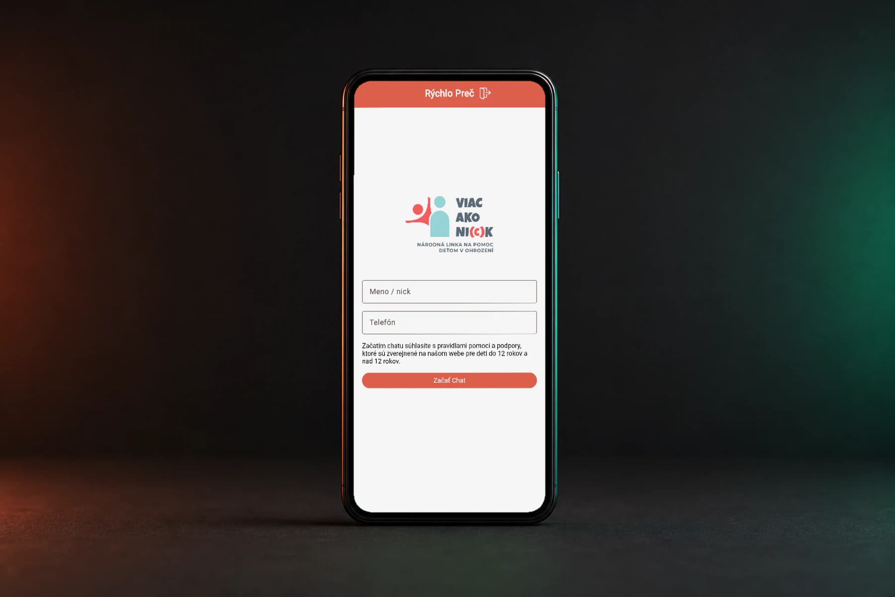
An interface that stays out of the way
We redesigned selected interface and colour treatments so the app reads more clearly and feels consistent throughout the conversation.
“In a sensitive service, the interface should help someone begin, not ask for attention.”
03
Together with HexaTech
We worked on the app with HexaTech s.r.o. Flutter and Dart kept one shared foundation for iOS and Android while both teams coordinated changes throughout delivery.
04
A more stable foundation
Alongside the redesign, we made targeted code fixes and removed bugs that affected app behaviour. The goal was to reduce crashes and improve communication and consistency across both platforms.
05
Available in both stores
The Flutter app is available in both the App Store and Google Play, with direct public links to the iOS and Android versions.
Application architecture
One experience. Four clear responsibilities.
Mobile screens, the shared Flutter core, the communication boundary, and delivery to two platforms stay separated while forming one product.
What keeps the mobile flow together
One journey across screens
We designed the screens as one connected mobile flow.
One shared Flutter foundation
Shared behaviour stayed in one Flutter and Dart foundation.
Networking outside the UI layer
We separated communication from the visual layer.
Reconnect without losing context
We handled reconnection without losing the conversation context.
The same flow on iOS and Android
We verified the same flow on iOS and Android.
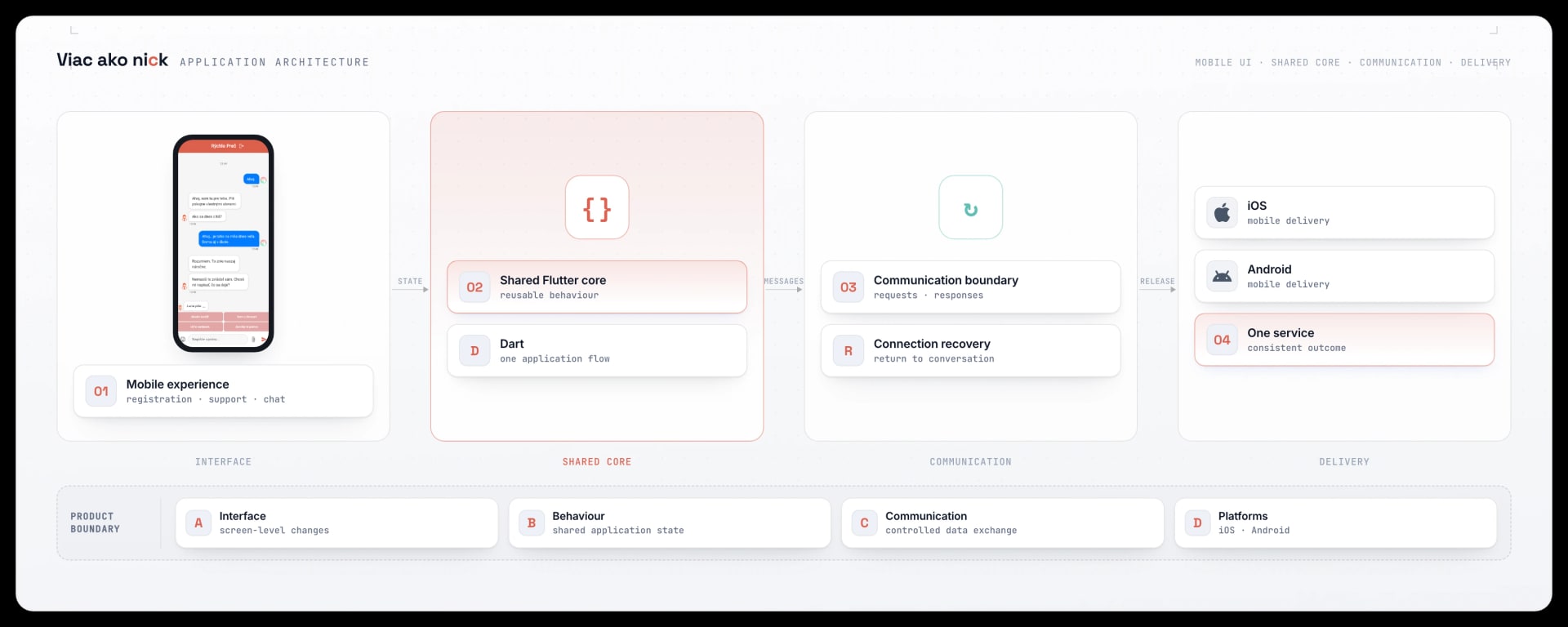
Scroll the diagram sideways.
- 01
Mobile interface
Registration and support selection form one clear whole with the conversation.
- 02
Shared core
Flutter and Dart hold reusable behaviour for both platforms.
- 03
Communication boundary
Controlled requests and responses stay outside the screens, as does recovery.
- 04
Two platforms
One mobile service is delivered to iOS and Android.
Development cycle
The redesign continued through to a verified release.
The visual change was only the first layer. Code stability, communication, reconnection, and verification on both platforms completed the work.
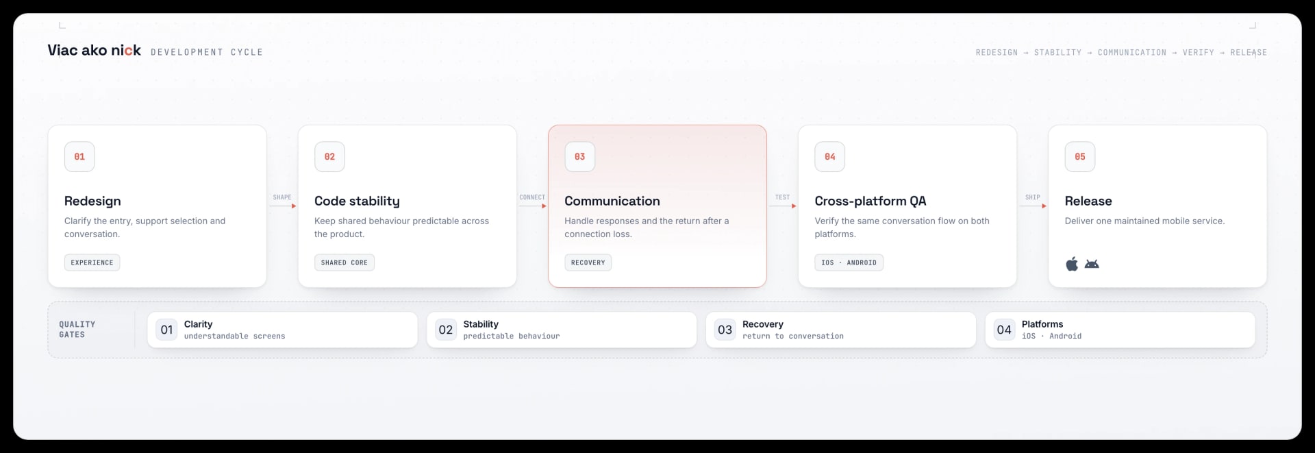
Scroll the diagram sideways.
- 01
Redesign
Unifying registration and support selection, up to the conversation.
- 02
Code stability
Behaviour fixes in the shared application foundation.
- 03
Communication and recovery
Clear responses and a return to the conversation after a connection loss.
- 04
Platform verification
The same flow and outcome on iOS and Android.
- 05
Release
One maintained mobile service in both stores.
Version 1 → Version 2
A calmer, steadier conversation than before
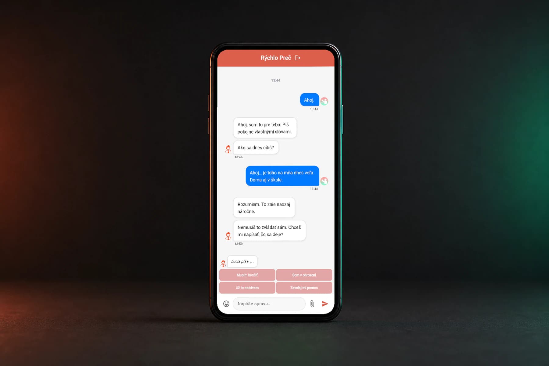
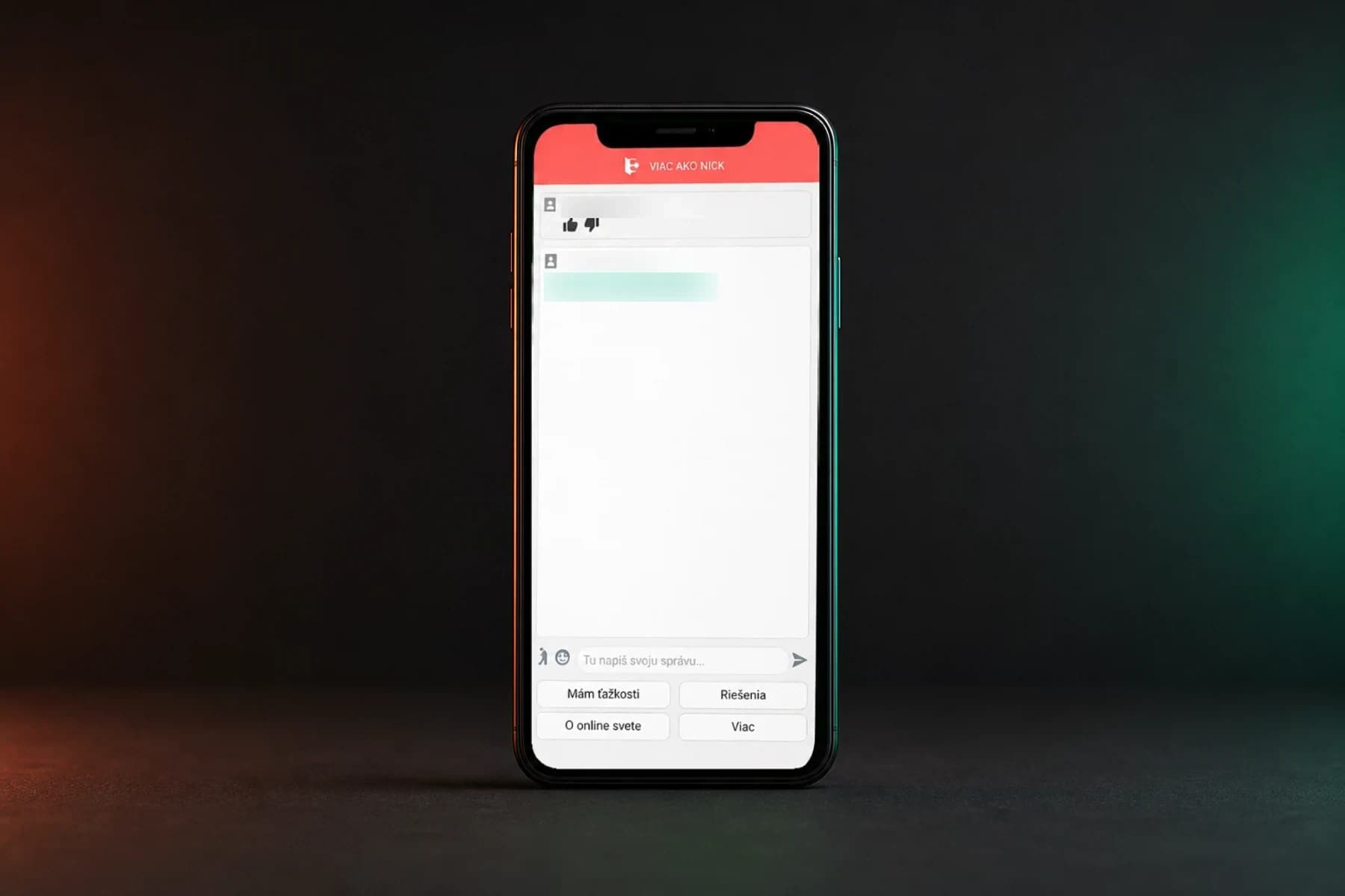
We reworked the new version from the server communication up to the conversation screens. The slider shows the original interface next to what children and consultants see in the app today.
Drag
What we created
- A typing indicator, so it is clear the consultant is replying
- Sending photos and files directly inside the chat
- An emergency exit to leave the app instantly
- Readable bubbles that tell the child and consultant apart
What we improved
- Stability and fewer crashes on iOS and Android
- A unified, calmer look across the conversation
- Readable messages instead of exposed internal usernames
- Redesigned quick replies for sensitive moments
- More reliable behaviour on a weak connection